
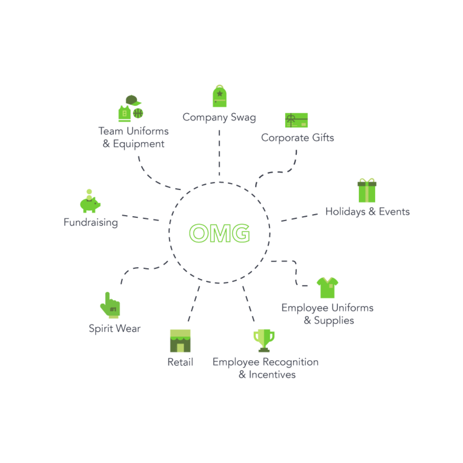
STORES
Meet our most popular online store options to take your business to new heights!
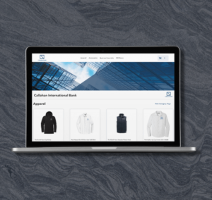
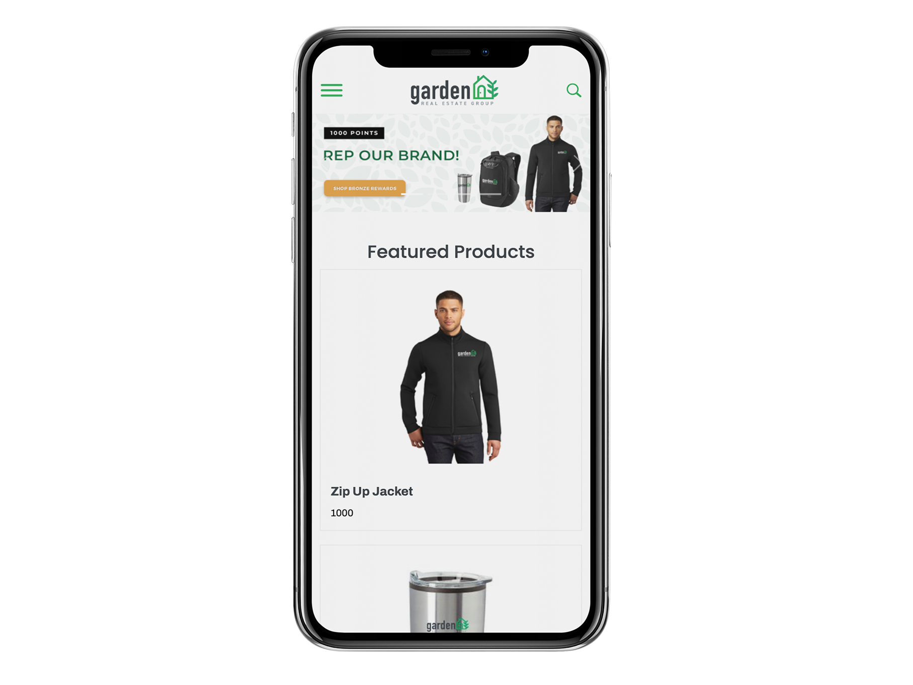
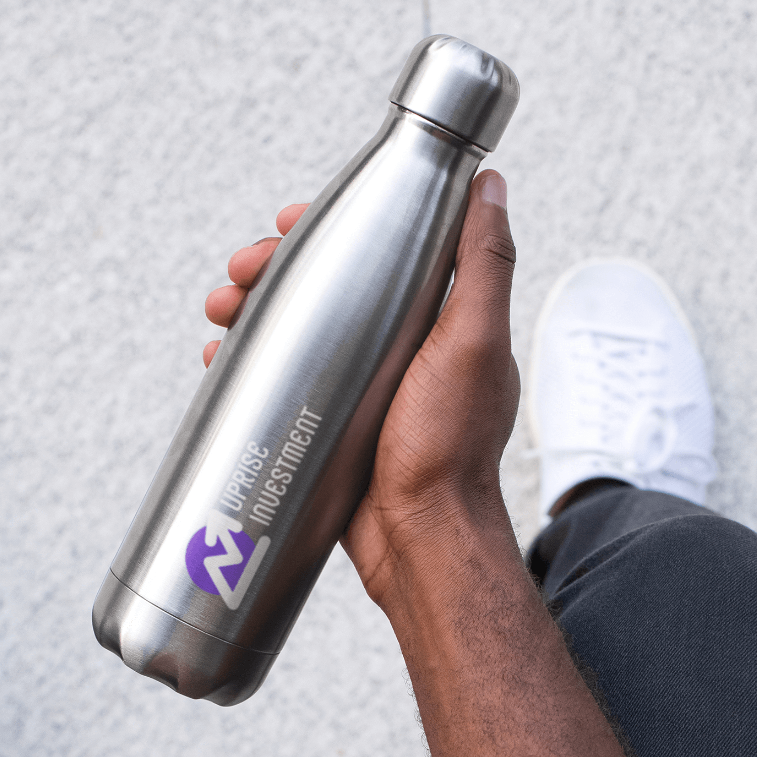
Provide sleek, fully-customized stores that reinforce your customer's unique brand.
Create custom online stores to fuel fundraising efforts.
Generate excitement and drive urgency with limited-time-only pop-up stores.
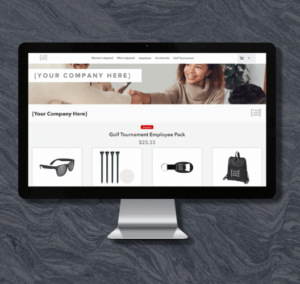
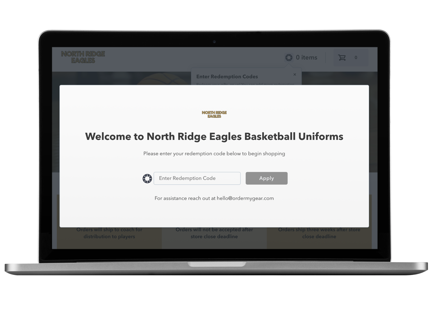
Collect and organize team orders to simplify the process and reduce manual tasks.
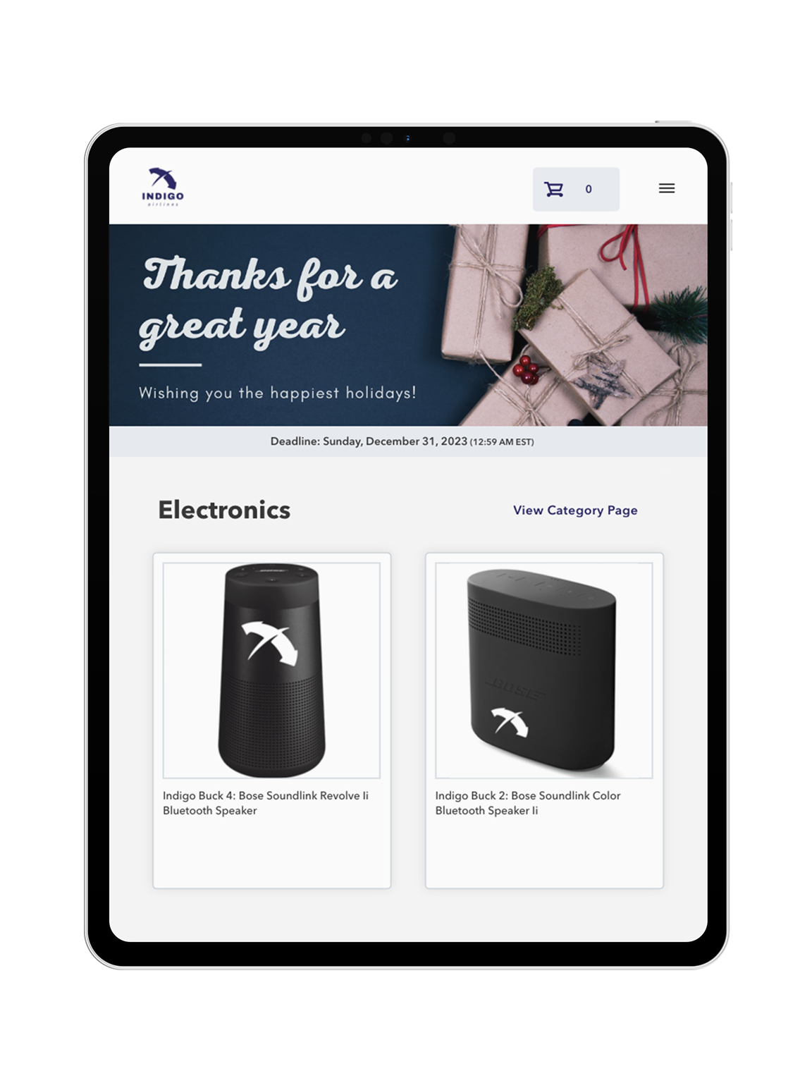
Delight customers with flexible online stores that make gifting convenient and secure.
Our pricing model reflects our partnership mentality – we succeed when you succeed.
FEATURES
With multiple options, you can find the perfect online store solution for your business and your customers.
Exceed customer expectations with retail-like online stores that are quick to create and ready to launch in record time.
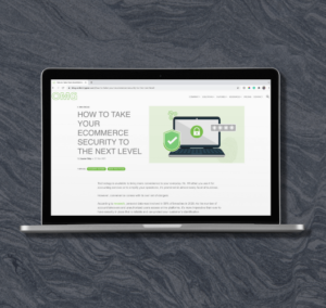
Rest easy with the knowledge that you’re partnering with a technology solution that takes security seriously.
Reduce manual tasks with an online store platform that makes it simple to monitor store performance and fulfill orders quickly.
Connect to third-party systems such as shop management, ERP, and order management systems using OMG APIs.
RESOURCES
Everything you need to know to help you start the process with OMG.
Everything from industry trends & insights to new feature announcements.
See what’s possible with our sample stores, tailored for various industries & programs.
See what the OMG Engineering team is up to these days!
Extra, extra! Read all about OMG in the news and see our big announcements.
These OMG clients have achieved incredible results using our online store platform.
Reach your customers with these helpful marketing resources.
Discover what it takes to become an online store expert!
ABOUT US
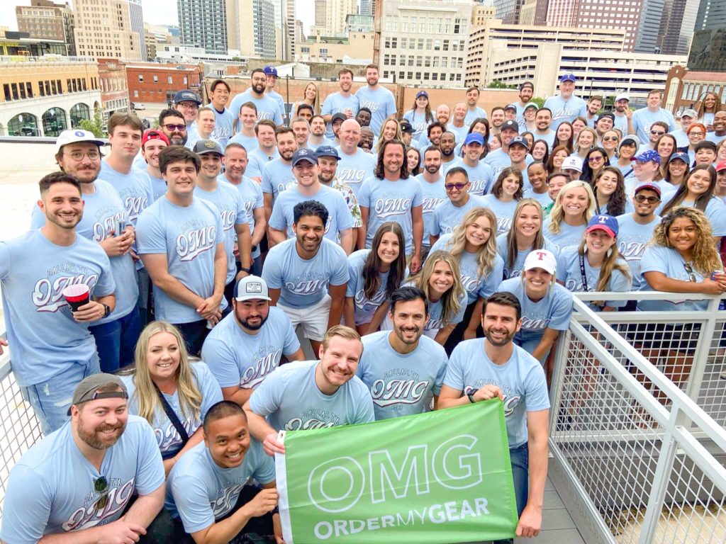
OMG offers an intuitive online store platform that powers growth for distributors, decorators, and dealers.
Be a part of the OMG Magic! Invest in your career and join the Team creating innovative technology solutions for our industry.
Meet OMG’s leaders who invest in the talent & technology that drives our innovation.
Let's start a conversation! Get ahold of OMG Sales, Support, or somewhere in between.


